Garnier Fructis · L’Oréal
Revitalizing hair care

Aperçu
Services
Brand architecture
Brand identity
Communication idea
Packaging design
Challenge
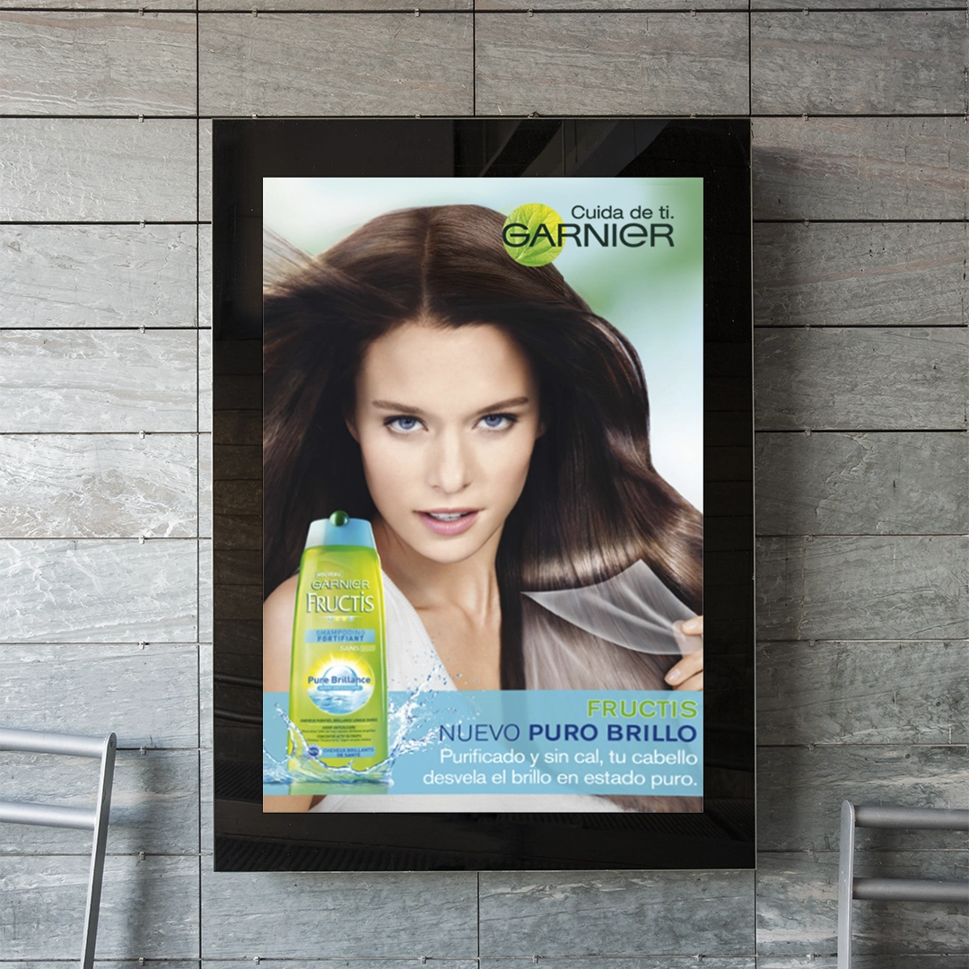
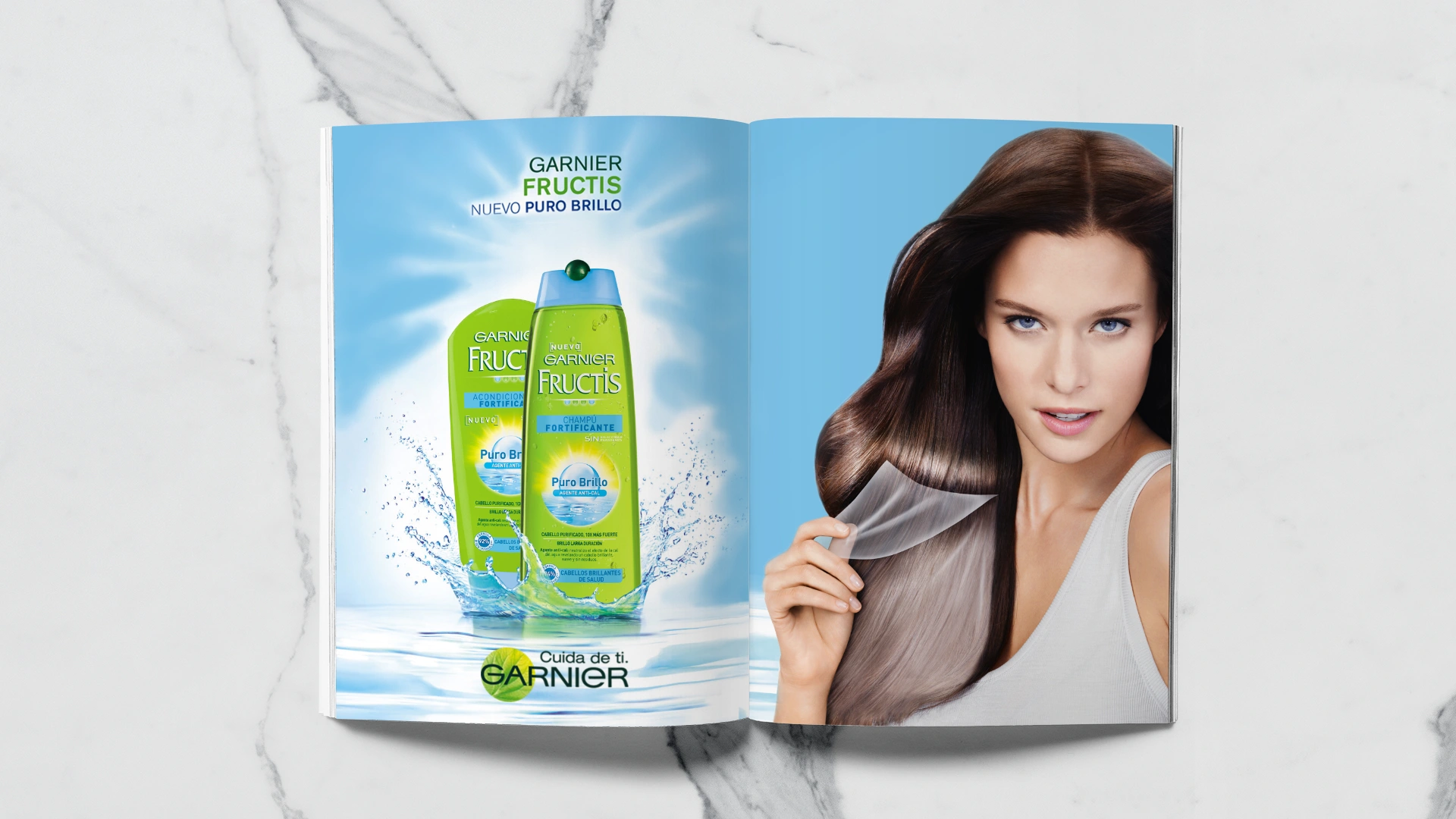
How can a well-established brand like Garnier Fructis refresh its image while remaining true to its core values and heritage? Our challenge was to segment the product line to cater to diverse consumer needs without losing the brand’s essence. We aimed to elevate Garnier Fructis’s perception as a leader in innovative hair care by showcasing the unique benefits of its formulas, ultimately positioning the brand as both effective and stylish.
Proposal
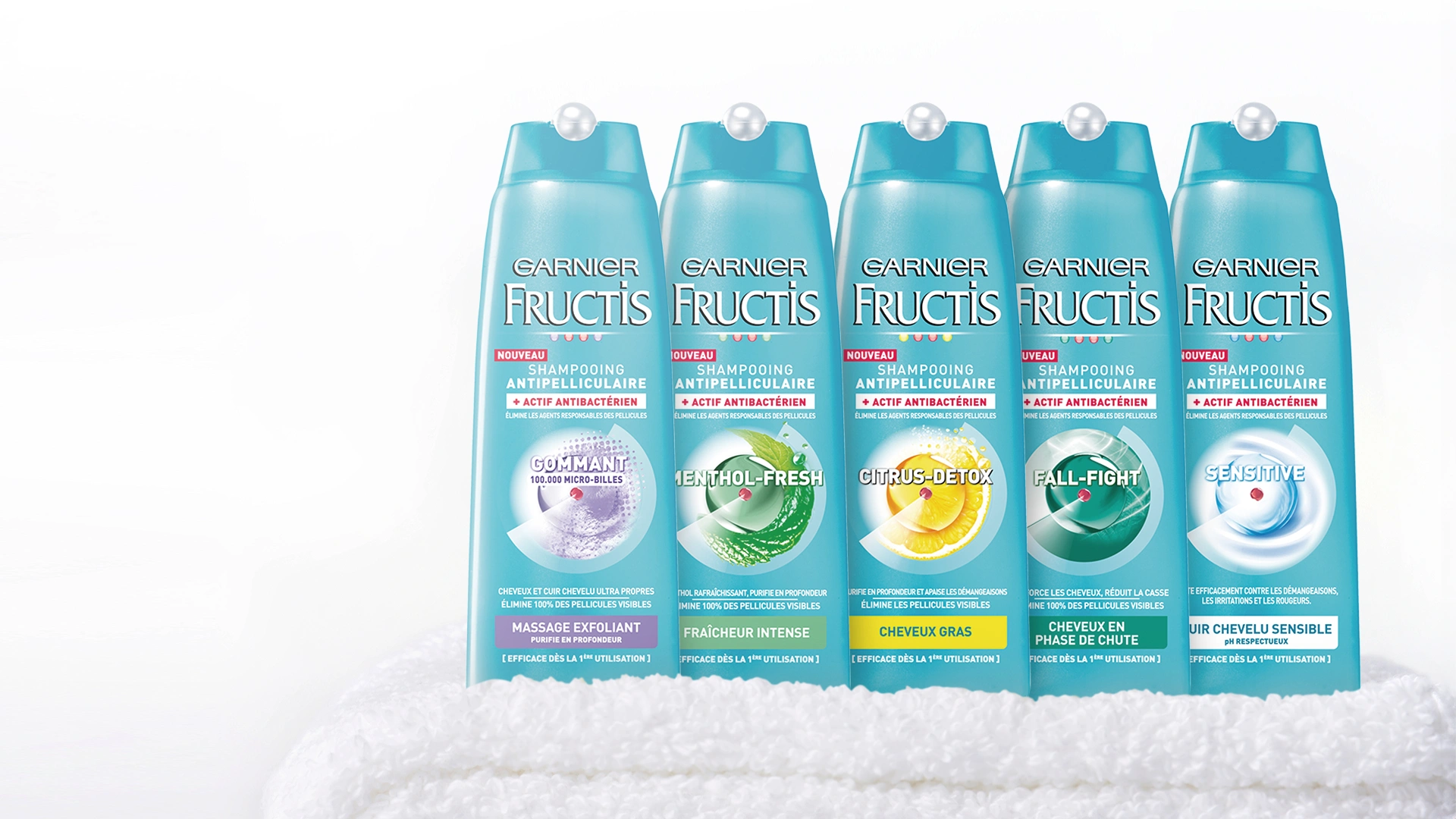
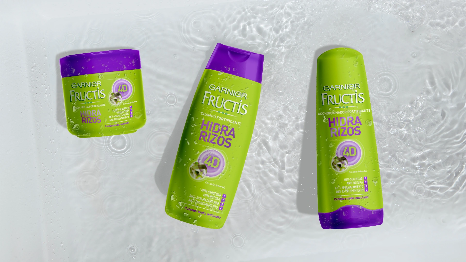
We reimagined the Garnier Fructis product range to highlight the specific benefits of each line, from strengthening to moisturizing. This segmentation allowed us to create distinct identities for each product while maintaining a cohesive brand language.
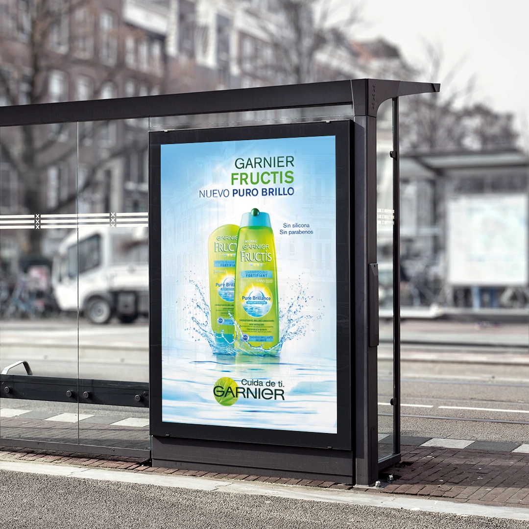
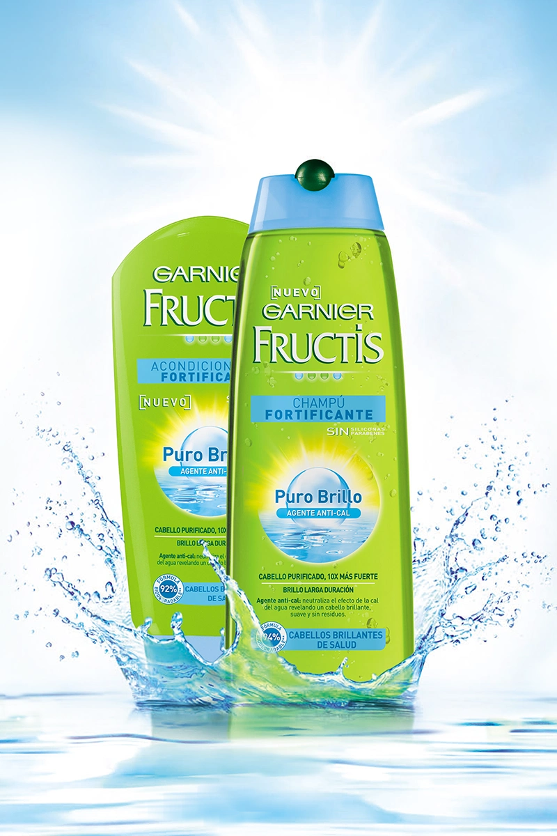
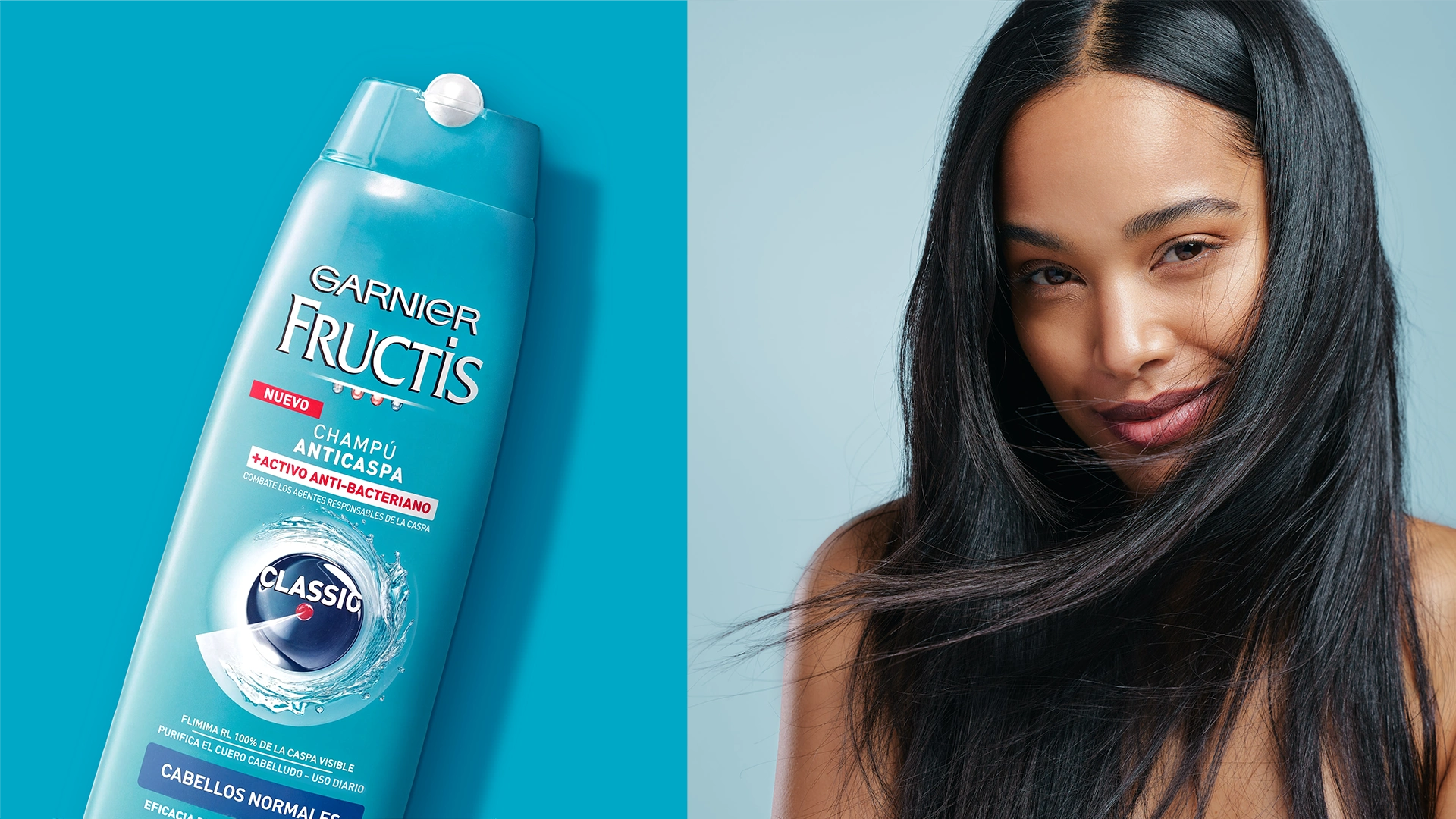
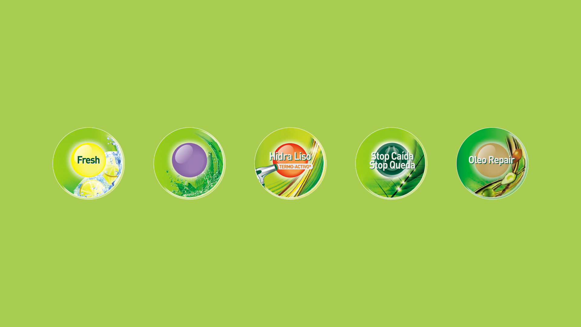
We focused on iconization by developing a bold, contemporary packaging design that captures attention on the shelves. Each product features vibrant colors and distinctive graphics that communicate its unique benefits at a glance. The key visual elements incorporate natural ingredients and textures, aligning with Garnier Fructis’s commitment to sustainability and wellness.
