LMA
1880, heritage as a signature
Overview
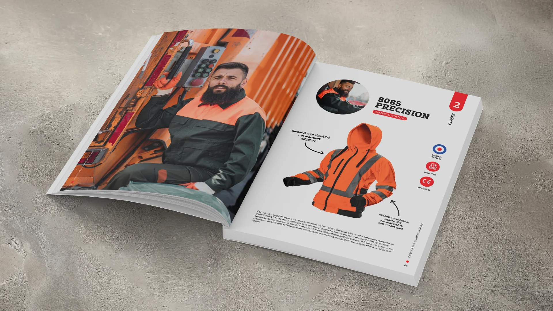
Since 1880, LMA has been a French, family-owned brand designing workwear in Amiens to support every everyday movement. Across all professions, day after day, season after season.
A unique know-how that blends the precision of textile tradition with a contemporary vision of workwear. Because when a garment is well made, it shows — in the work, and over time.
Services
Audiovisual production
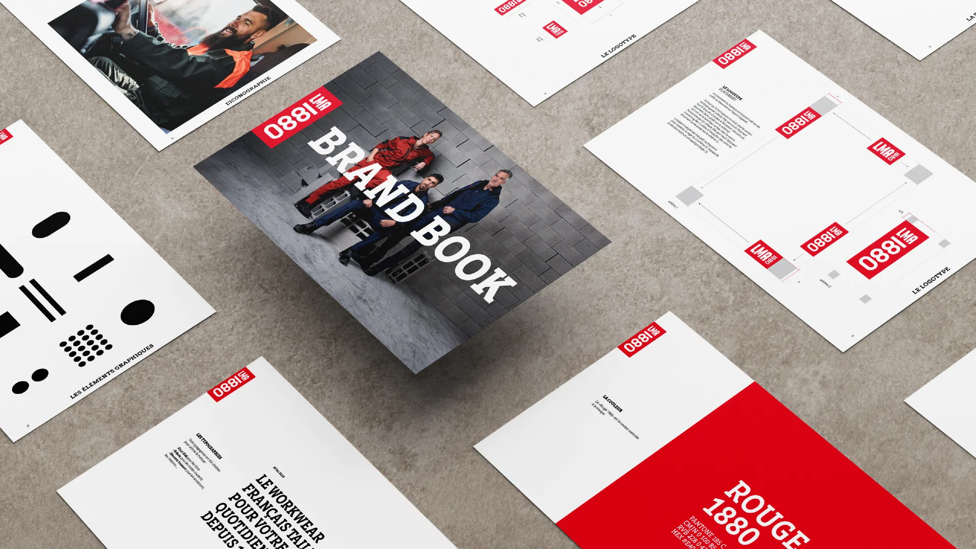
Brand guidelines
Brand identity
Brand strategy
Communication strategy
Visual identity
Challenge
To support its growth and international expansion, the brand needed to evolve and better reflect what today’s workwear demands: strength, technicality and clarity.
Together with LMA, we led an in-depth strategic process to define a strong brand platform. From there, we tailored a new identity built to last.
Proposal
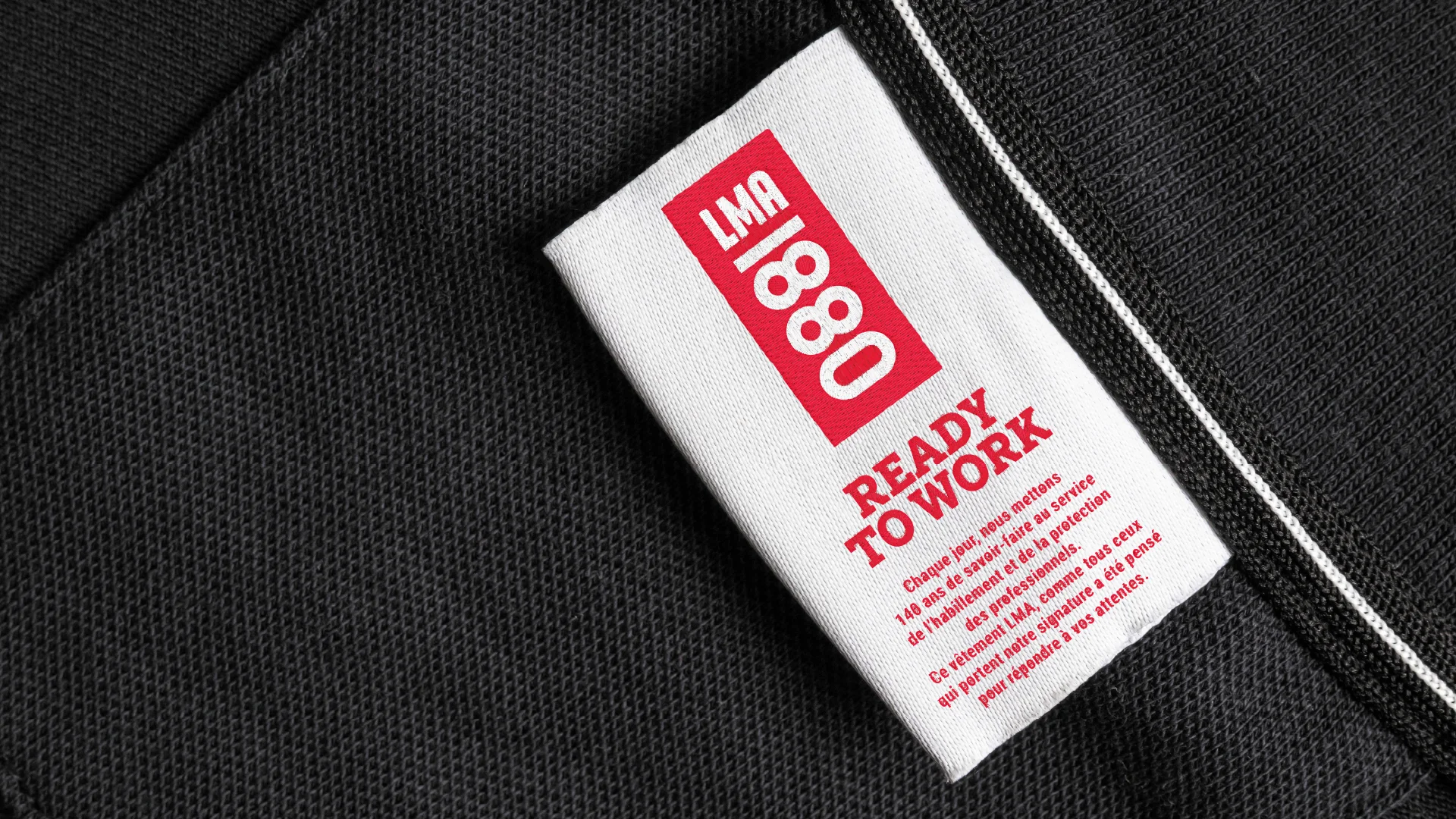
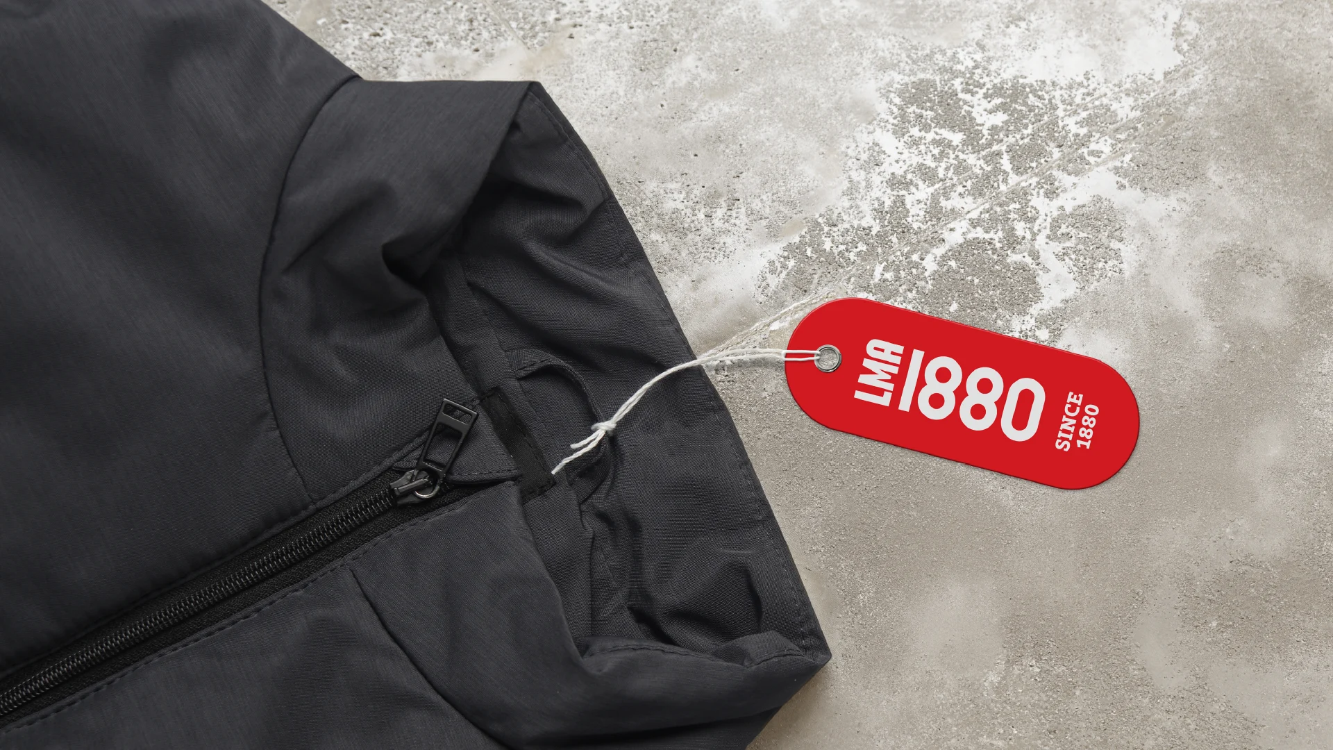
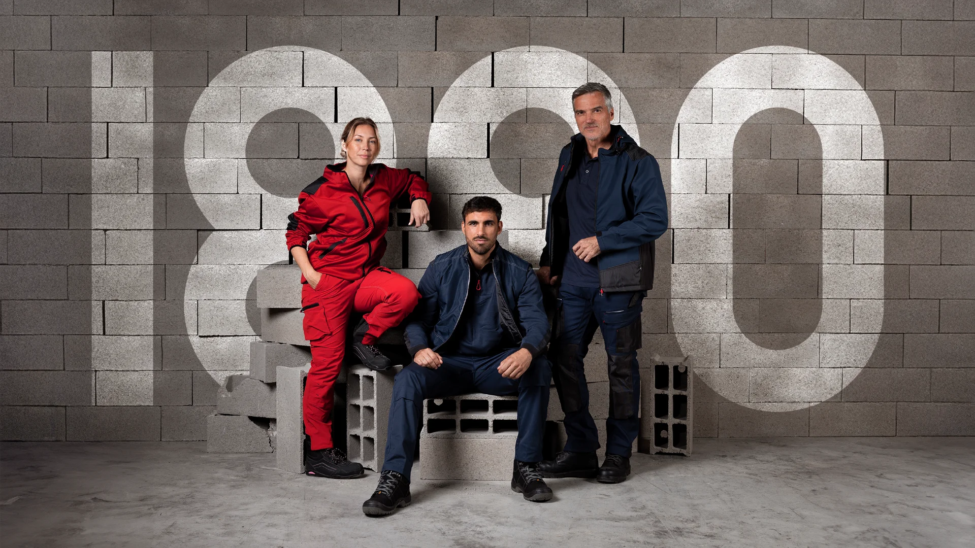
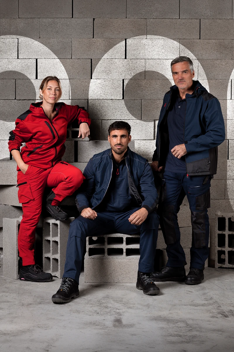
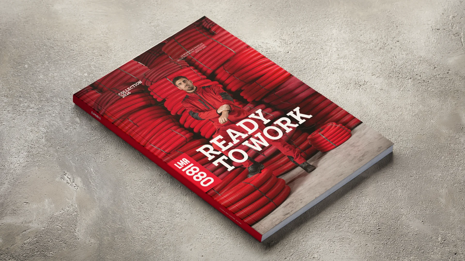
At the core of the rebranding, we turned 1880 into a true graphic emblem. More than a historical reference, the founding year becomes the brand’s totem.
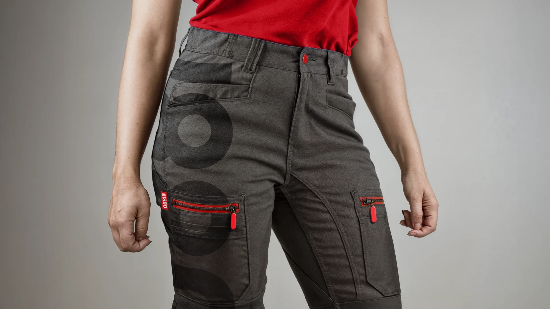
Its typographic treatment takes advantage of the perfect vertical symmetry of 1880, transforming it into a bold and powerful symbol. Paired with the LMA name, it creates a compact, solid brand block, easy to spot across all the brand’s “outfits”: garments, catalogues and e-commerce.
The signature red boosts visibility, while the contrast between the vertical block and the horizontal reading of LMA establishes a clear, efficient and memorable graphic rhythm. An identity that holds its shape — no loose threads.
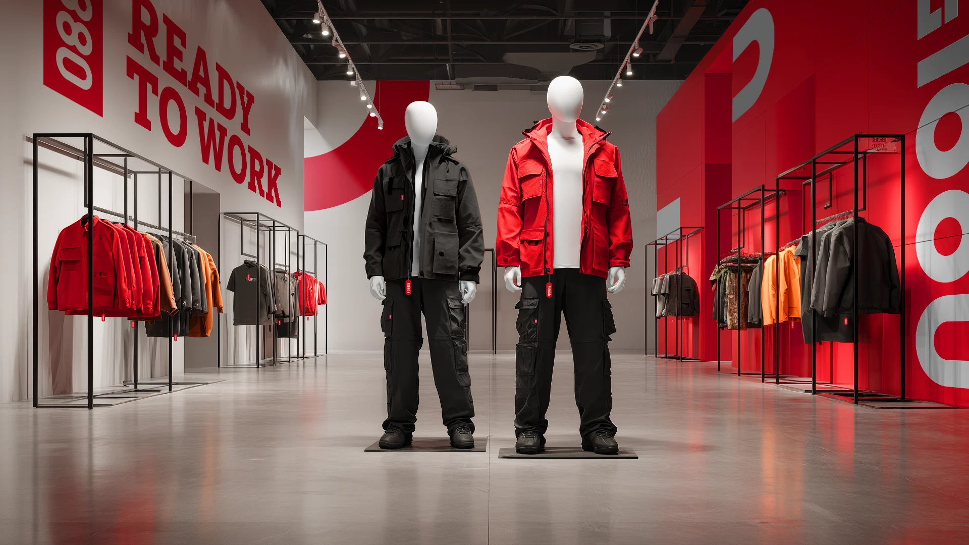
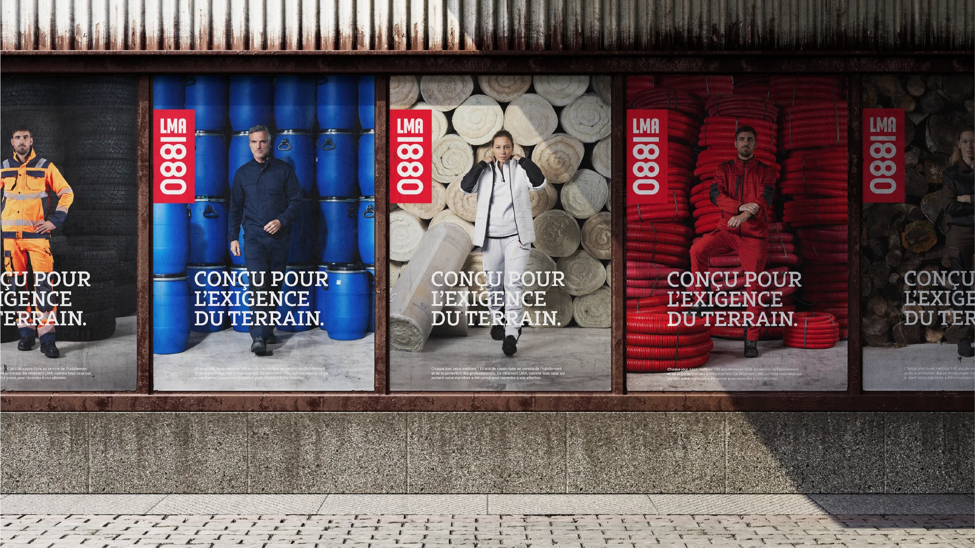
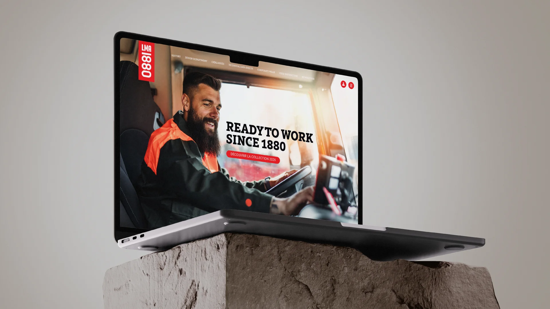
To complete this new visual “workwear,” we introduced the signature READY TO WORK. Three words that capture the brand’s promise: clothing designed for the field, tested in real working conditions and ready to perform the moment you put it on.