Bigler
Unmistakably Swiss!
Overview
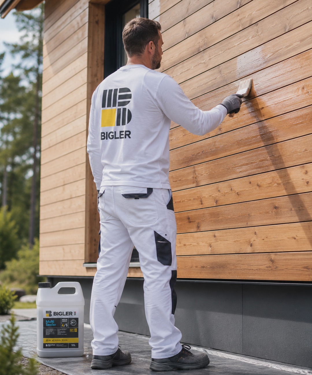
Bigler is a heritage Swiss brand specialising in products for the preparation, protection, decoration and maintenance of parquet flooring and interior wood.
Deeply rooted in its home market, the brand has grown alongside craftspeople, developing an in-depth understanding of their practices and creating solutions specifically designed to meet the needs of Swiss professionals.
Services
Brand architecture
Brand identity
Brand strategy
Packaging design
Visual identity
Challenge
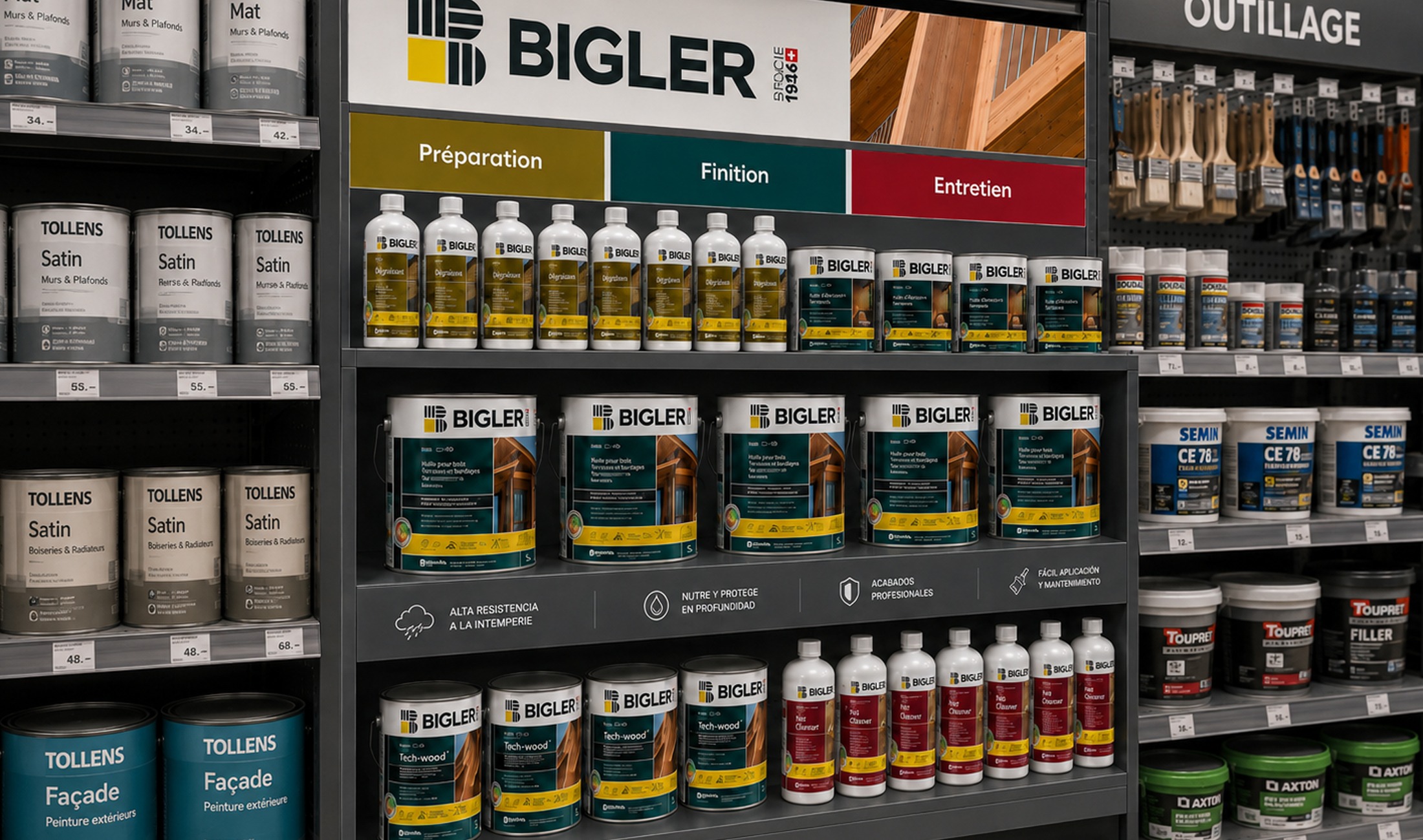
Following its integration into the Blanchon Group, Bigler entrusted us with the rebranding of the brand, with a dual ambition: to strengthen its position as a reference among flooring professionals while opening up a new distribution channel through specialist trade retailers.
The challenge was to modernise Bigler without losing what makes it strong: its Swiss roots, technical credibility and close relationship with professionals. We also needed to create an identity capable of clarifying and structuring a growing product portfolio, while increasing the brand’s impact and visibility among new audiences.
Proposal
We first redefined the brand platform around a simple idea: Bigler is serious without being austere, expert without being distant, rigorous without being complicated. A brand that reflects the craftspeople it works alongside: straightforward, reliable and efficient, with a genuine commitment to a job well done.
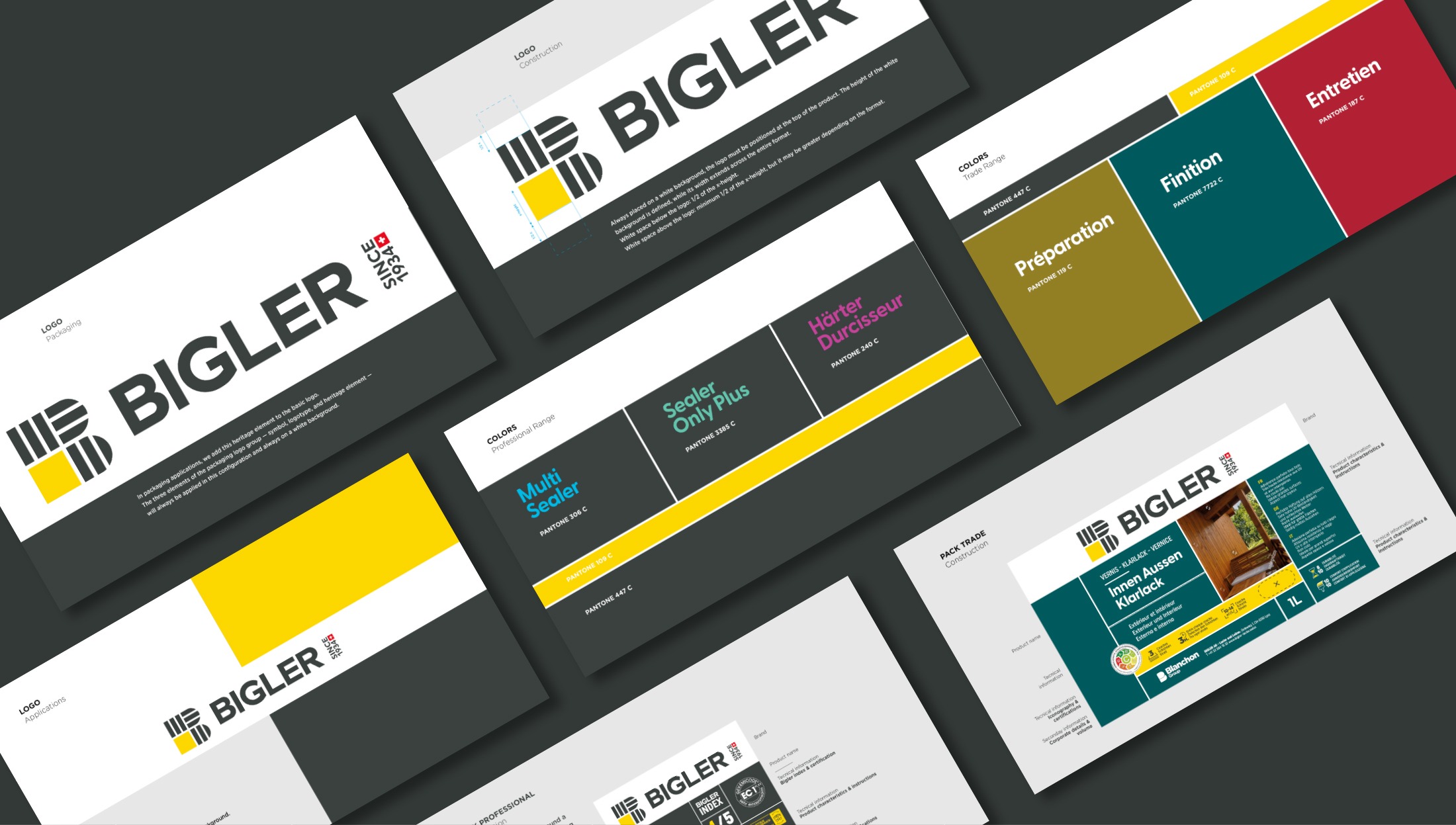
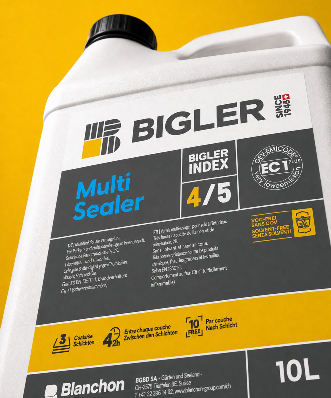
This vision comes to life through a new visual identity whose construction draws directly from the world of parquet flooring. The Bigler “B”, redesigned and simplified, evokes the precise assembly and interlocking of wooden planks.
We turned this principle into much more than a graphic device: it became the building block for the entire identity. Just as parquet flooring is created through the repetition, alignment and precise interlocking of individual planks, Bigler’s visual system is built around blocks that fit together with precision to create a coherent whole.
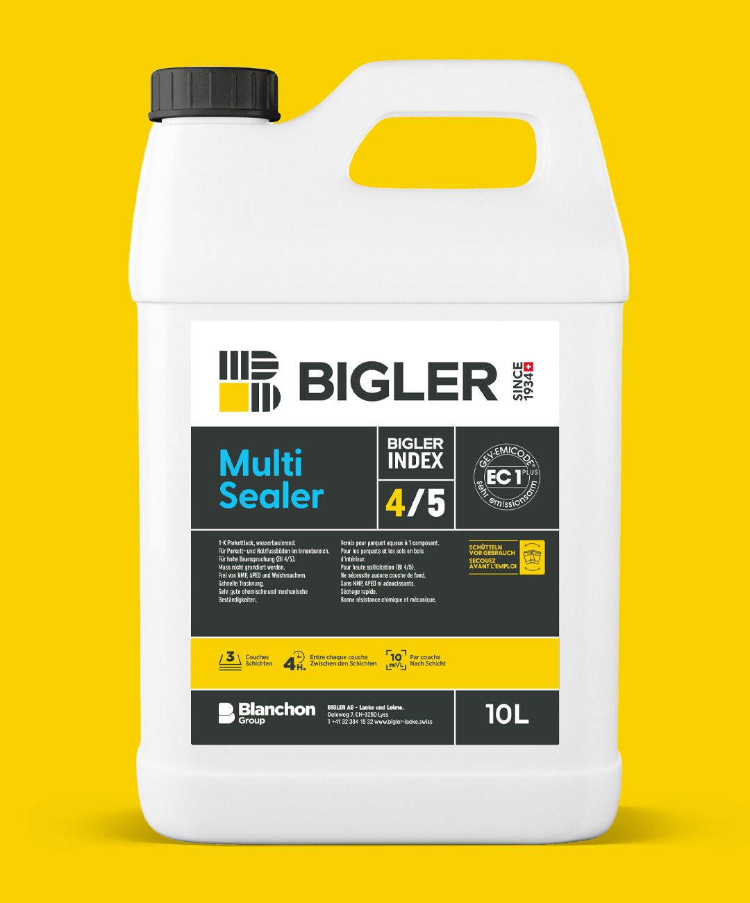
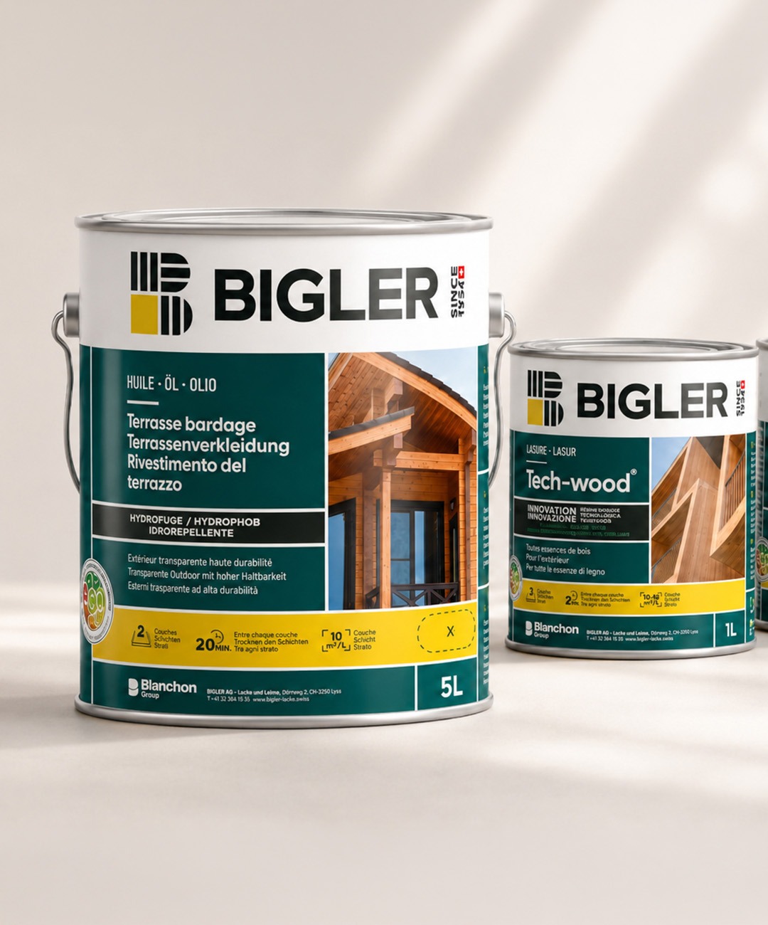
This logic also structures the packaging: information, colours, typography and graphic elements all sit within a precise, systematic framework. Every element finds its rightful place, like the individual pieces of a perfectly crafted assembly.
The result is a visual language directly inspired by the expertise of the people the brand serves: precision, construction and craftsmanship. Bigler expresses its expertise through an identity that is clear, professional and instantly recognisable, with a flexible system that can be consistently applied across its entire portfolio.