Auchan
Reinventing an iconic international brand with a gentle hand

Overview
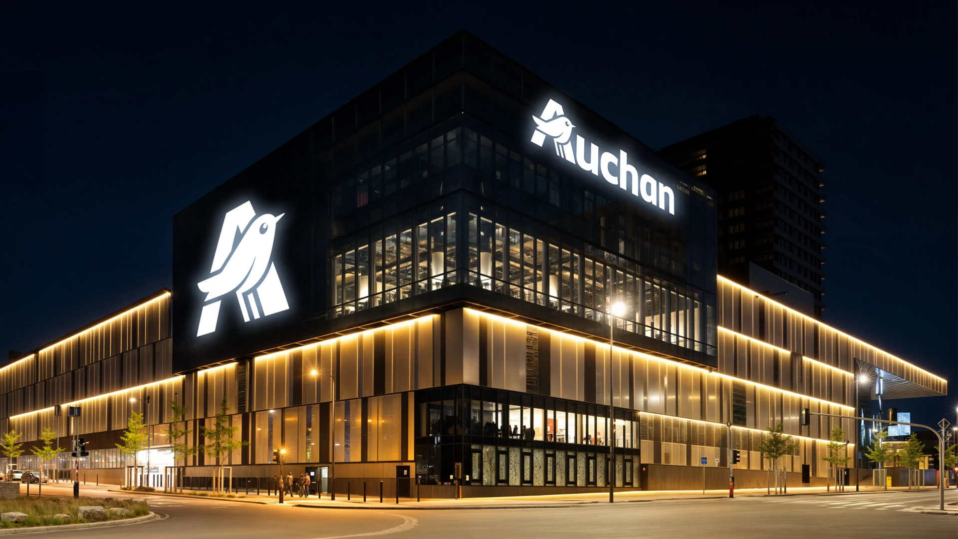
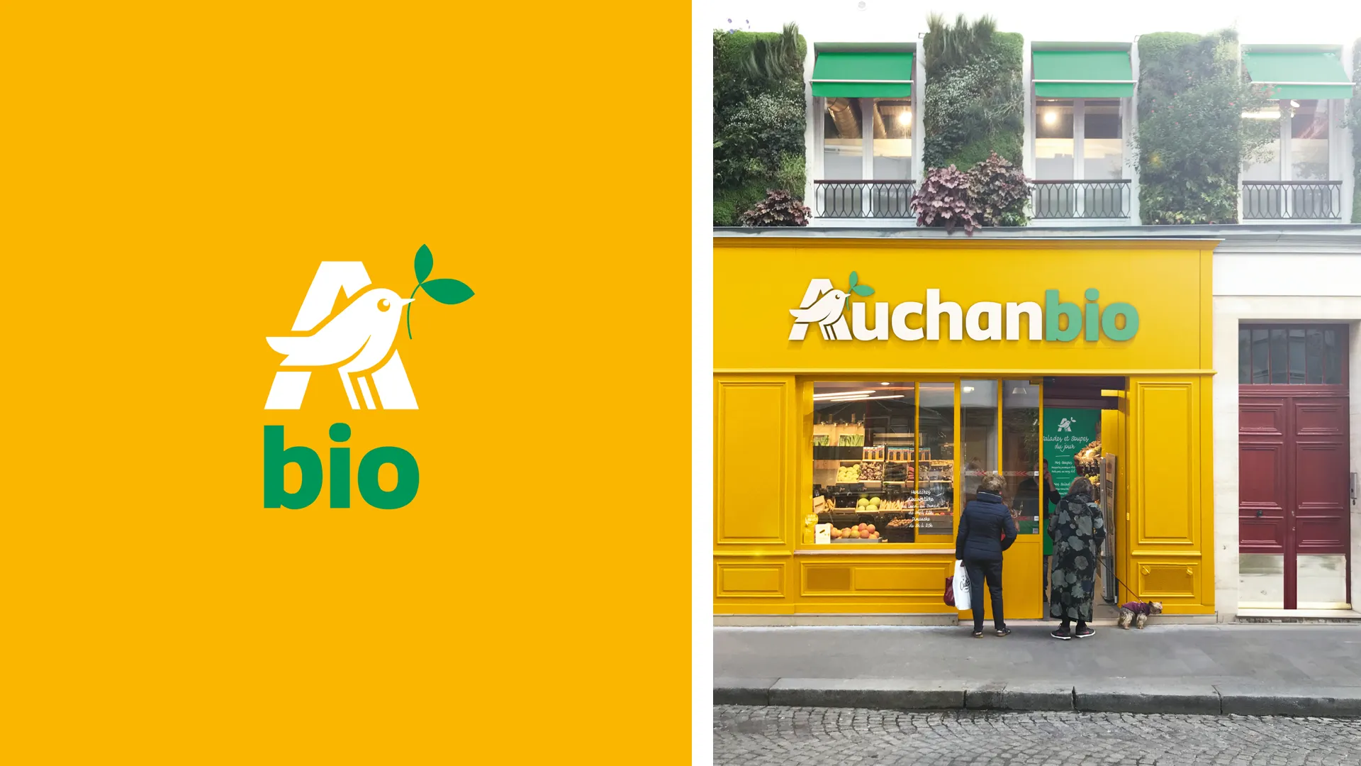
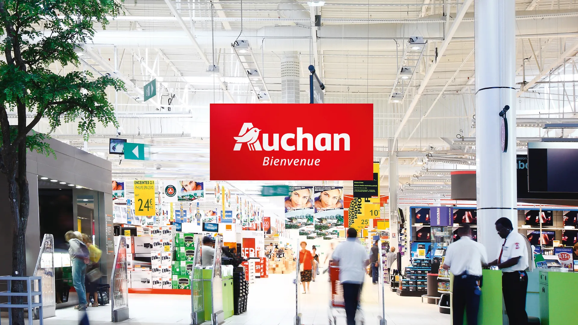
Auchan, one of the world’s leading retail brands, boasts a logo—crafted by Michel Disle—that has stayed the same for 32 years! In 2014, Auchan entrusted us with the sensitive task of reimagining it to better convey just how modern and dynamic the brand is.
Services
Brand guidelines
Brand identity
Corporate identity
Visual identity
Challenge
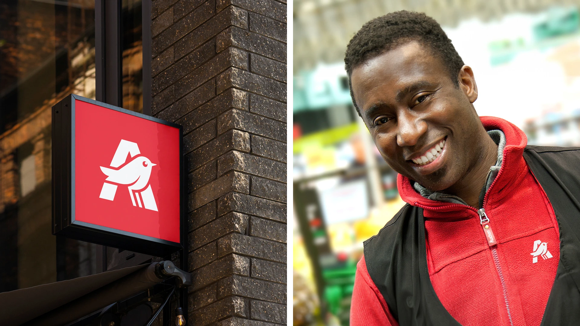
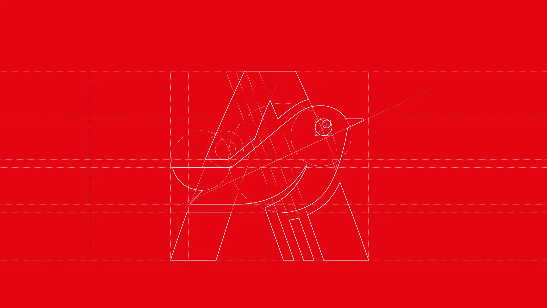
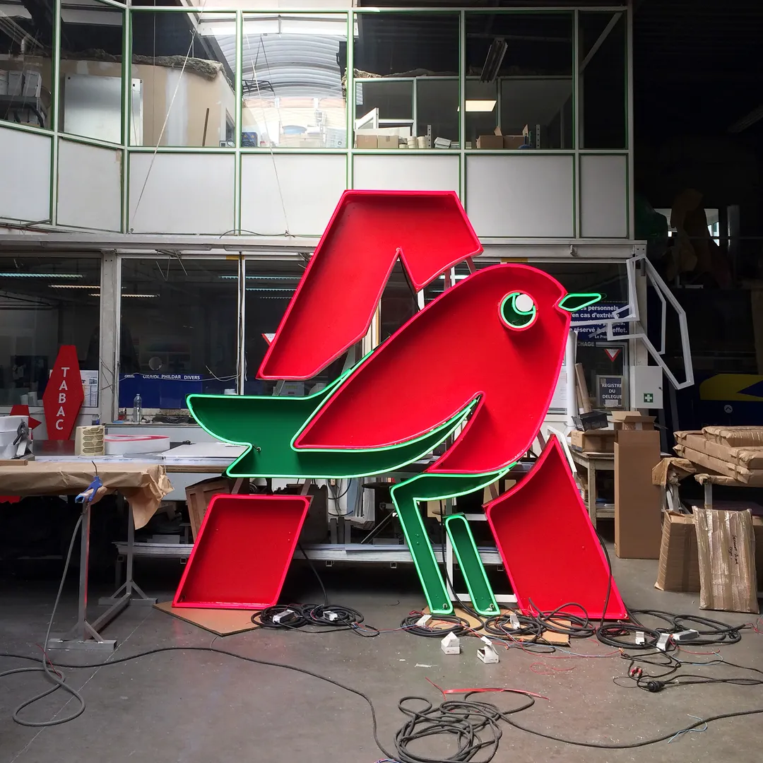
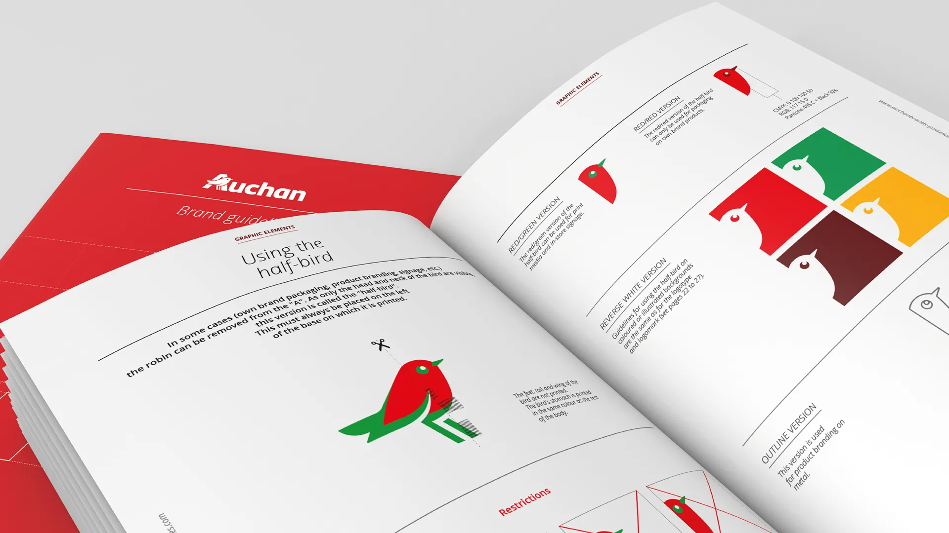
It was crucial to build upon the strongest elements in the logo: the red, the green and the bird nestled inside the “A.” The bird being snugly perched inside the “A” remained untouched because it is particularly significant: the bird doesn’t represent Auchan, it’s at Auchan, it’s “in the fields”, it feels at home there, acting as a link, a touchpoint between the brand and its customers.
Proposal
With a delicate hand, we fine-tuned this globally respected, appreciated and well-loved logo. This is what made the project particularly exciting for our team: modernizing without disrupting. The robin’s new design—simpler, rounder and more vibrant—was coupled with the creation of a new custom typeface in collaboration with the talented type design studio, Production Type.
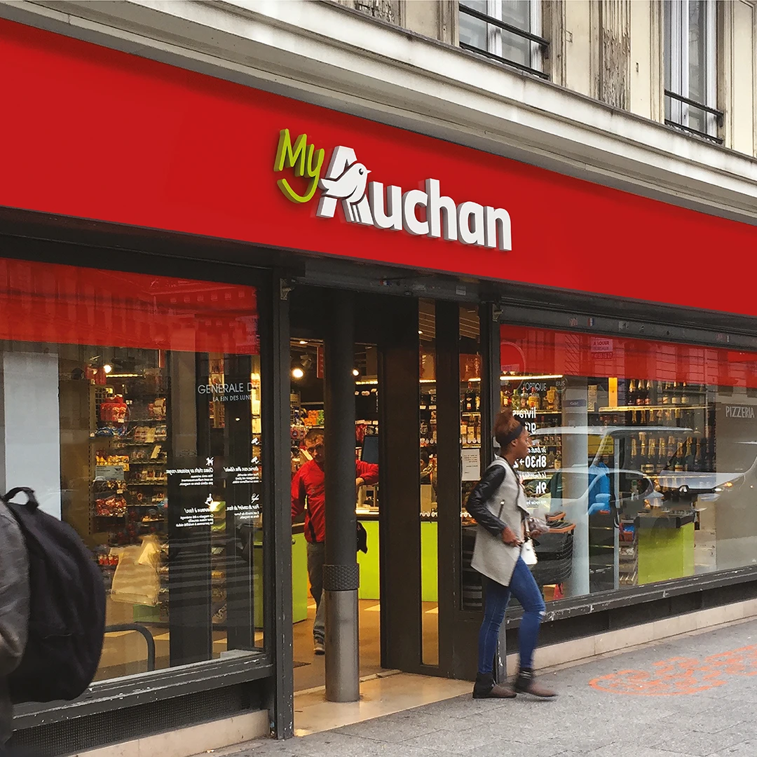
The evolution of the Auchan logo came with a brand-new visual identity. All of these new graphic elements were compiled in a brand book that will empower and unify the Auchan brand worldwide in stores, online and across all institutional and public communication platforms.
“
In line with the goals, the new logo does a better job at activating the desired aspects of the brand: innovation, modernity and dynamism."
Rachelle Larivière
Director of Auchan International Branding Division