Thuasne
170 years and a brand in tip-top shape
Overview
Founded in 1847, Thuasne is one of the leading medical textiles firms. With over 2,500 employees, they design and manufacture personalised and non-invasive healthcare solutions around the world. With a longstanding partnership of over 15 years, Thuasne has once again placed their trust in us to completely overhaul their brand identity.
Services
Brand architecture
Brand guidelines
Brand identity
Brand platform
Communication strategy
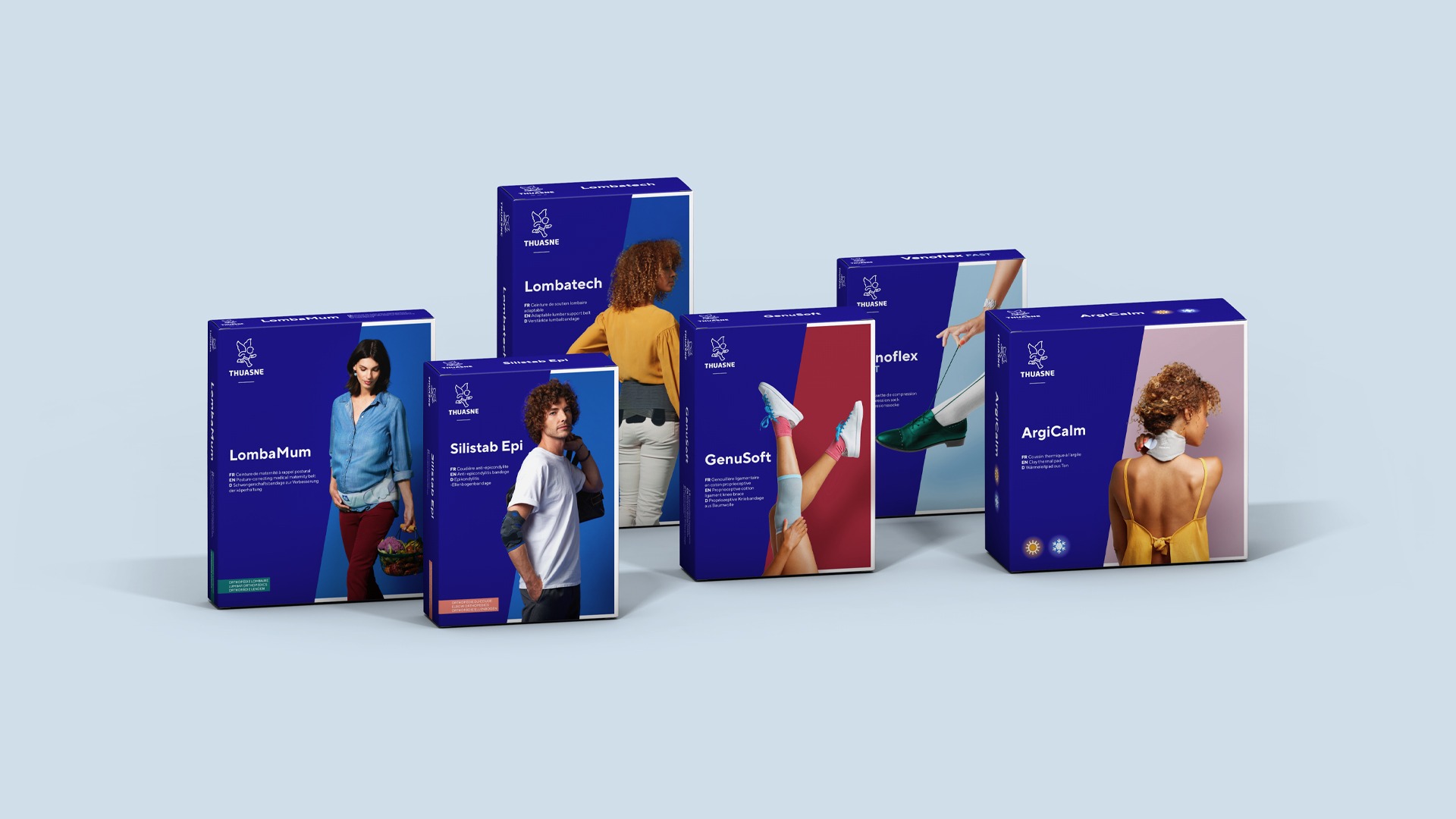
Packaging design
Challenge
Thuasne is going through a transformation and pursuing international development to fulfil the missions it has set for itself and meet the requirements of today. The new brand identity is intended to reflect and embody this ambition, both internally and externally.
Proposal
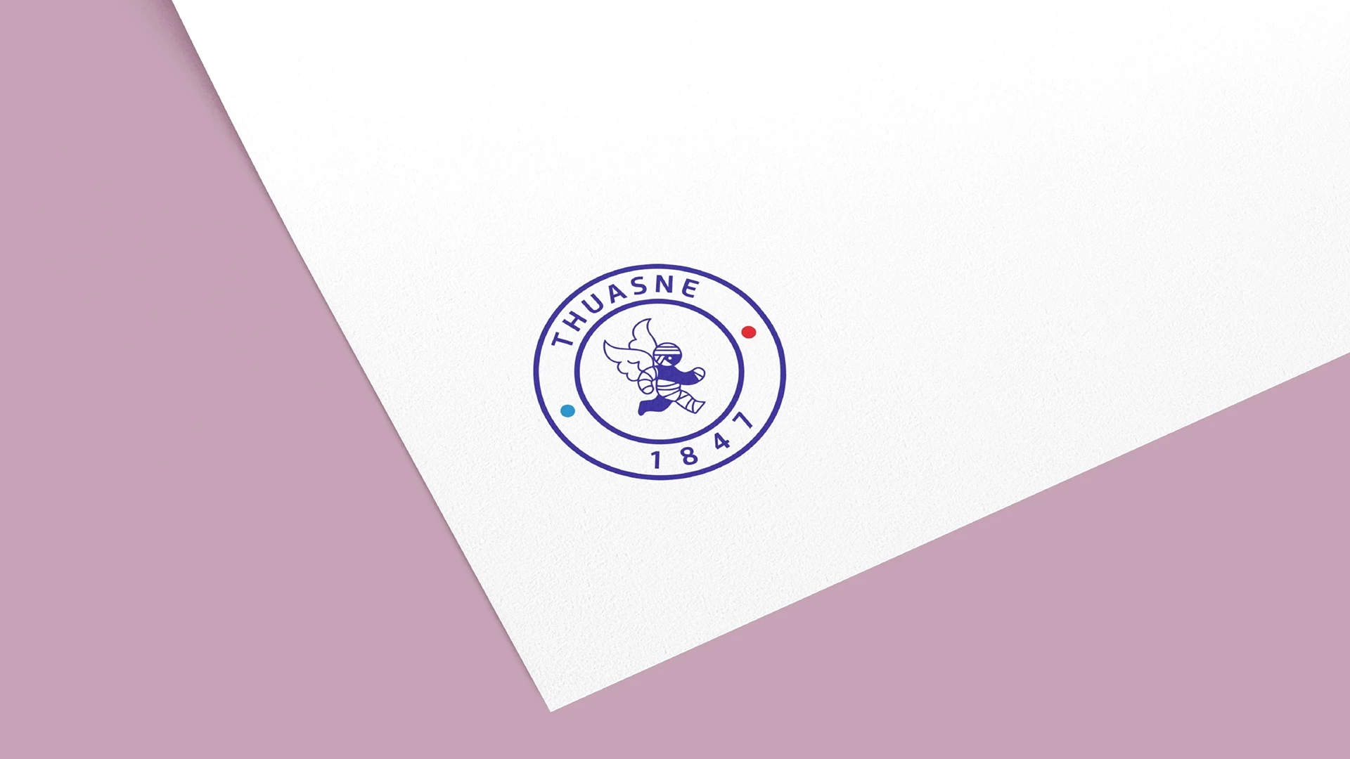
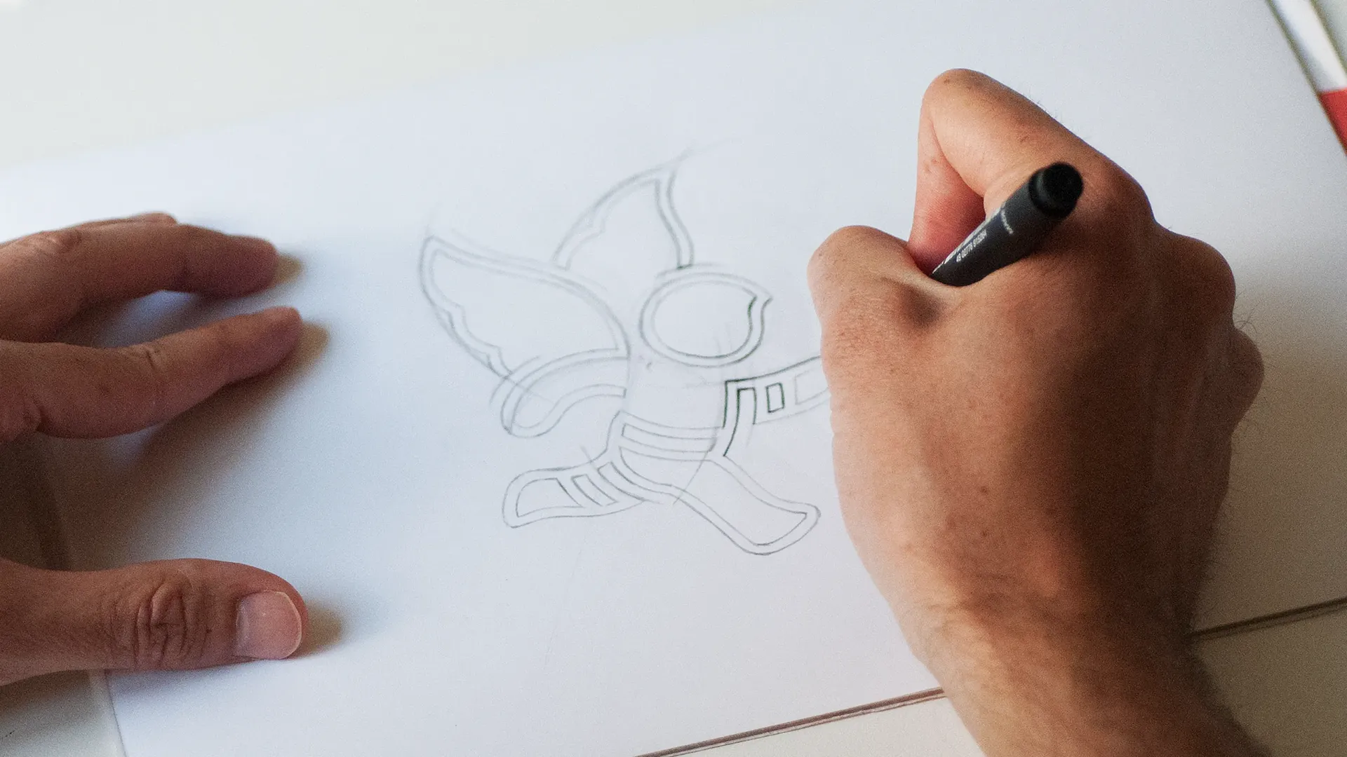
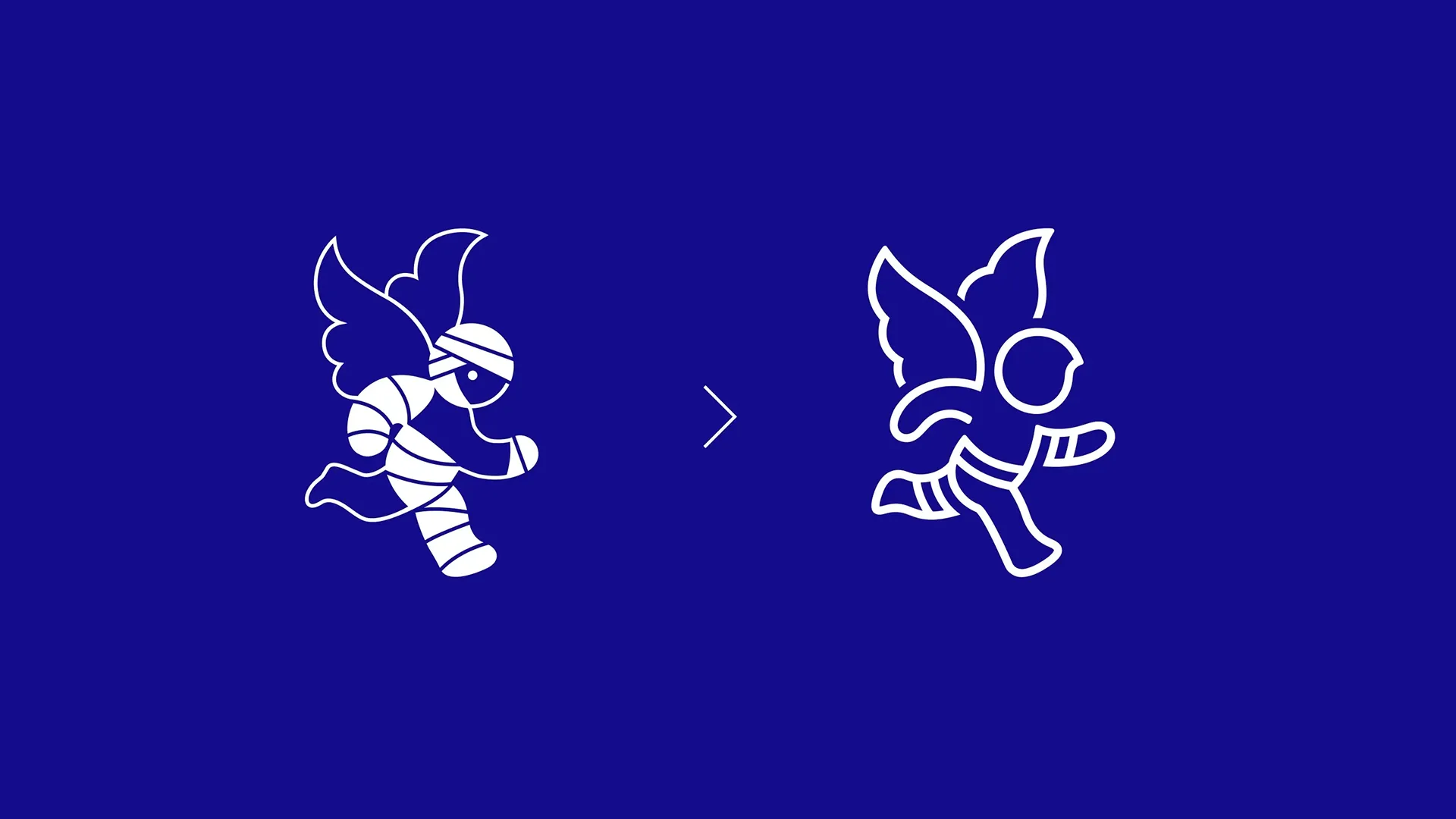
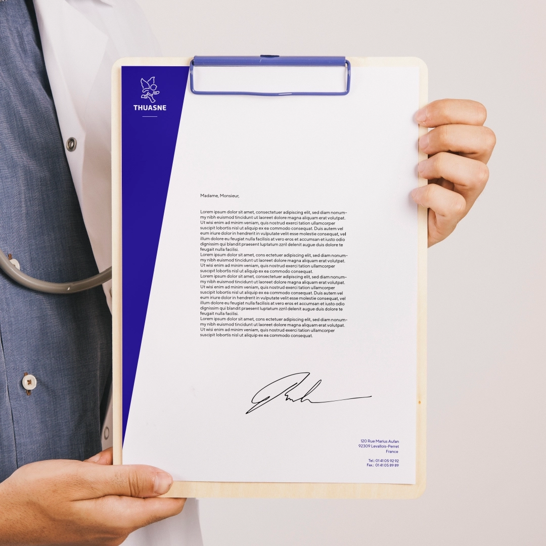
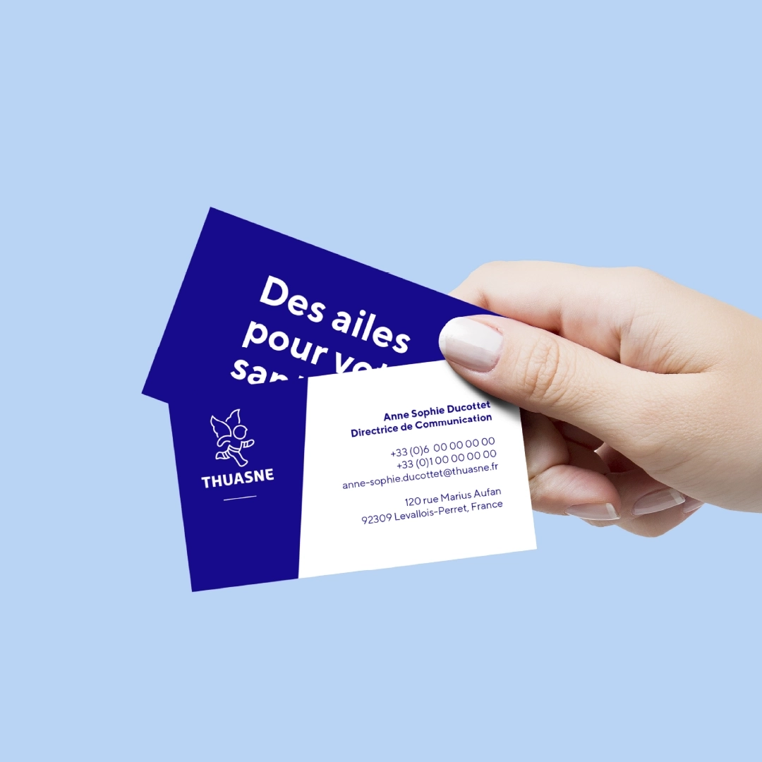
All aspects of the brand’s identity have been reimagined. We have redesigned their famous little angel which had been the brand’s emblem for 60 years and scarcely changed in all that time. While making sure to retain its friendly and recognisable silhouette, we simplified and refined it. Released from the bandages on its head, it runs towards its newfound freedom. Its design is open and consists of a single line, reminiscent of a weaving thread, the main component of all the brand’s products.
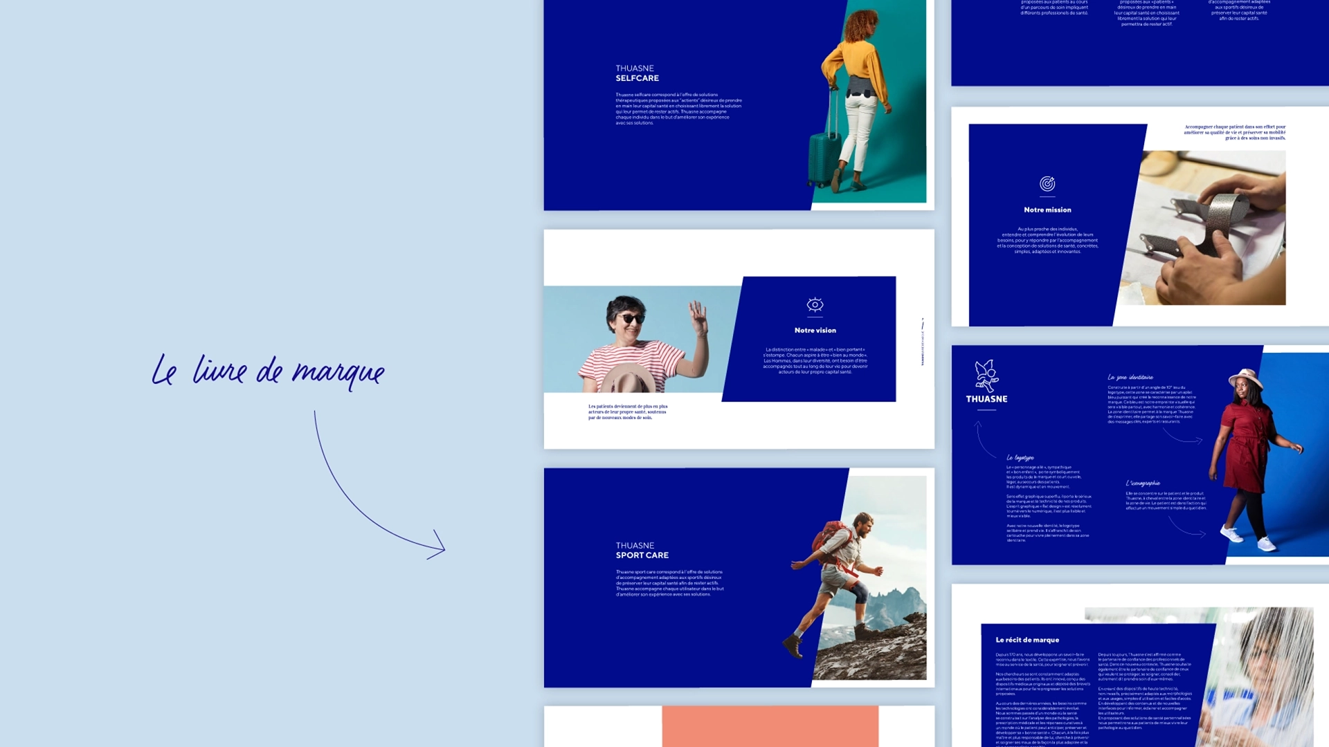
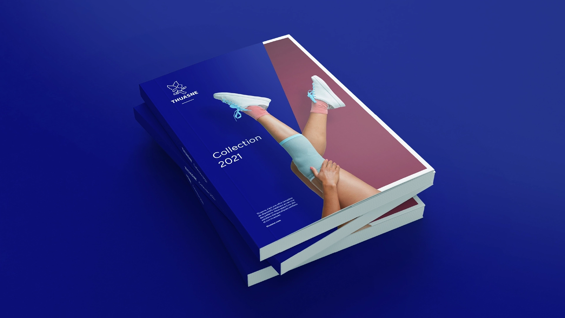
The brand expresses itself with a new dynamic, on a 10° slant that mirrors the determined posture of the Thuasne angel. The entire brand identity unfolds around this specific angle. The Thuasne blue is swapped out for a new tone that is just as powerful but also more elegant. The iconography has also been redesigned to be more everyday, cheerful and relaxed.
A distinctly contemporary visual territory, in line with Thuasne’s promise: to give their patients wings, lightness and movement once again.
“
Thank you for working with our teams to refresh our brand. It is an important and considerable transformation.
Elizabeth Ducottet
President


