Vincennes Hippodrome de Paris
More Than Just a Racetrack
Overview
Created in 1863, the Vincennes Racecourse is a reference for harness racing in France, Europe and the rest of the world, earning it the nickname of the “Temple of Trotting”.
Project in collaboration with Désigne Agency.
Services
Brand experience
Brand identity
Brand strategy
Communication idea
POS
Storytelling
Challenge
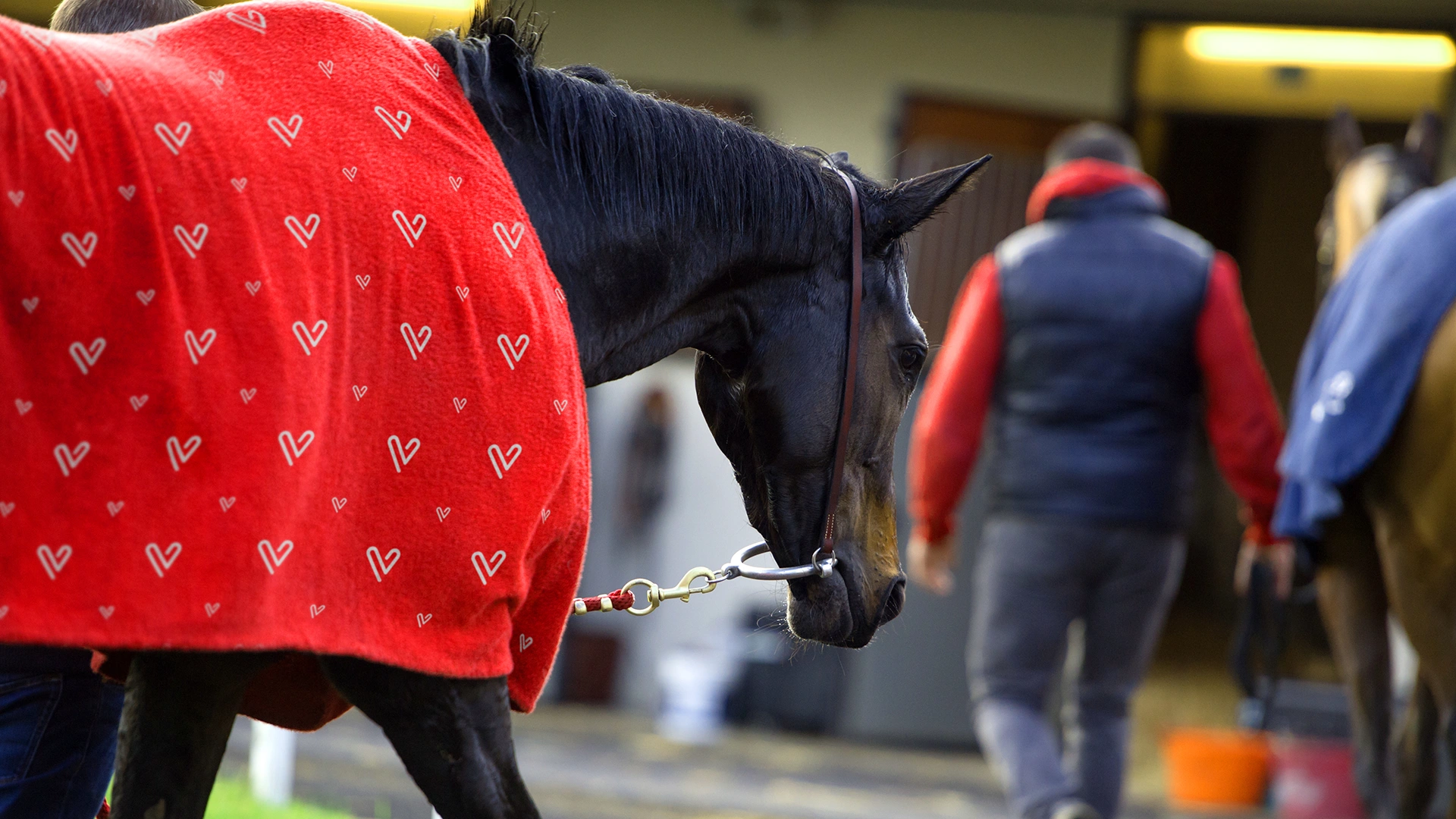
Spanning over 100 acres in the heart of the Bois de Vincennes, what makes the racecourse unique is the fact that it has 2 tracks: a small, floodlit track for night races, and a large, steeply banked track for which it is renowned. Now, itsname has been changed to Vincennes Hippodrome de Paris, a new name that reflects the site’s new ambitions: to be much more than a racecourse, to be a modern venue, a place for sharing and excitement.
We wanted to work on a visual identity that could go beyond the classic codes of the equestrian world and appeal to a wider audience.


Proposal
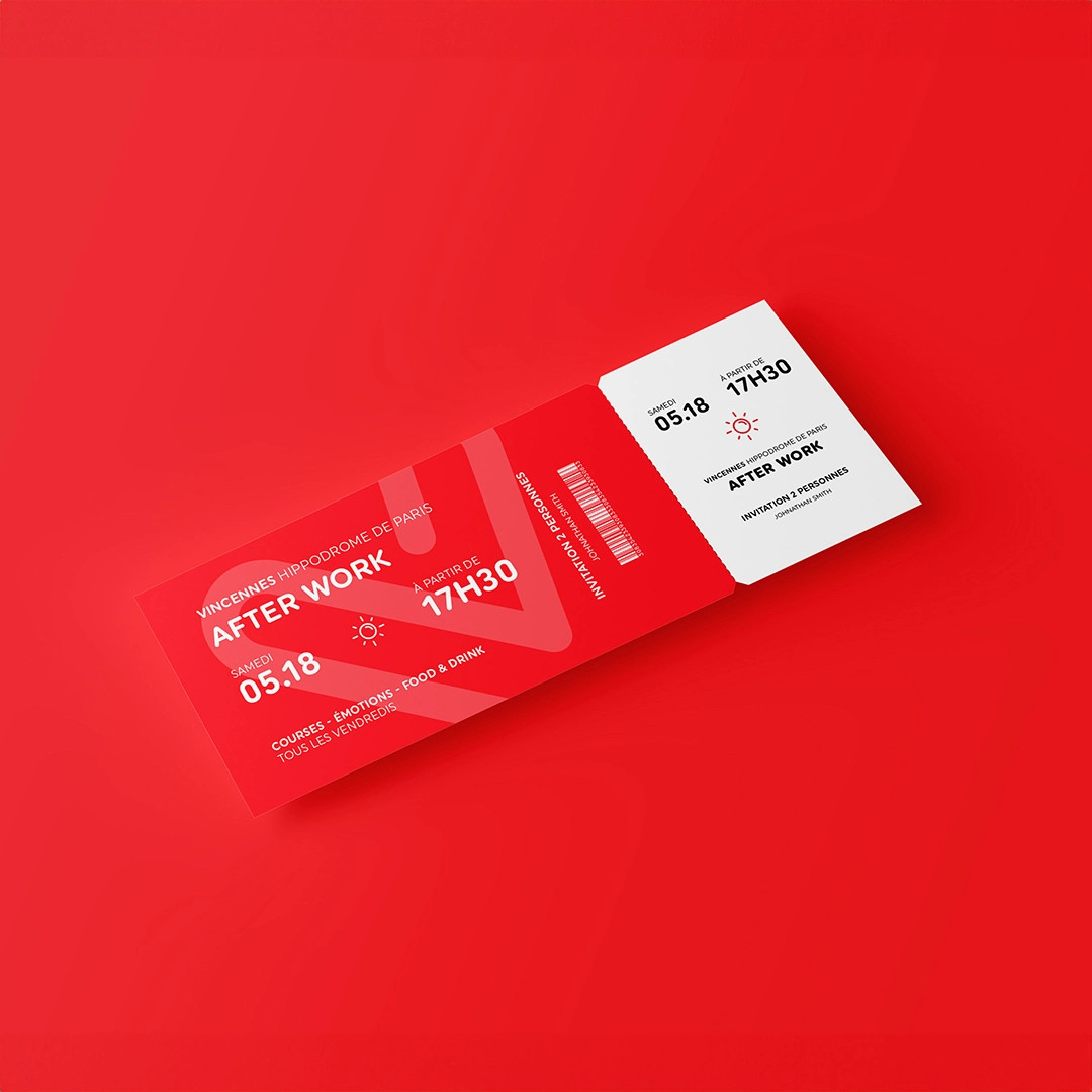
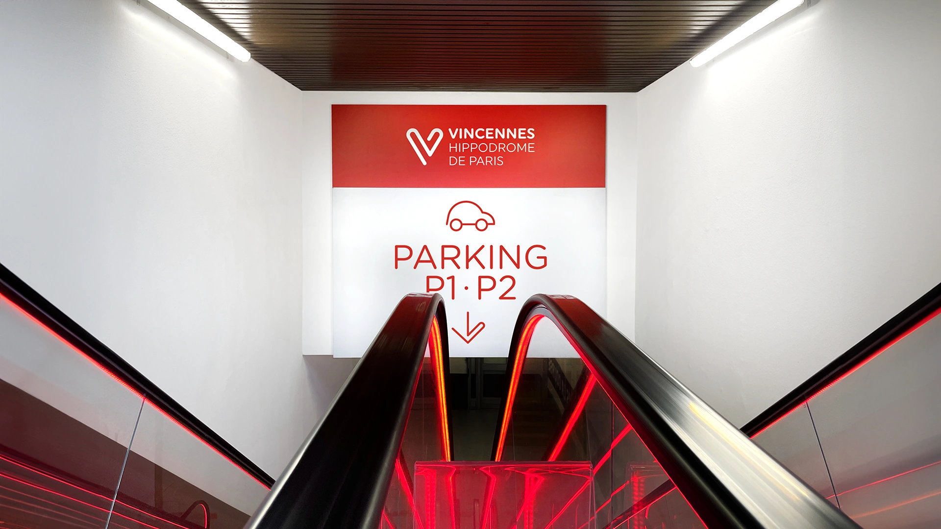
We came up with a logo that brings three powerful ideas together in one single symbol. V for Vincennes and for Victoire, the famous finishing post at the Hippodrome. The continuous line of the 2 race tracks and, lastly, the heart, to evoke the passion and emotion felt at this legendary venue.
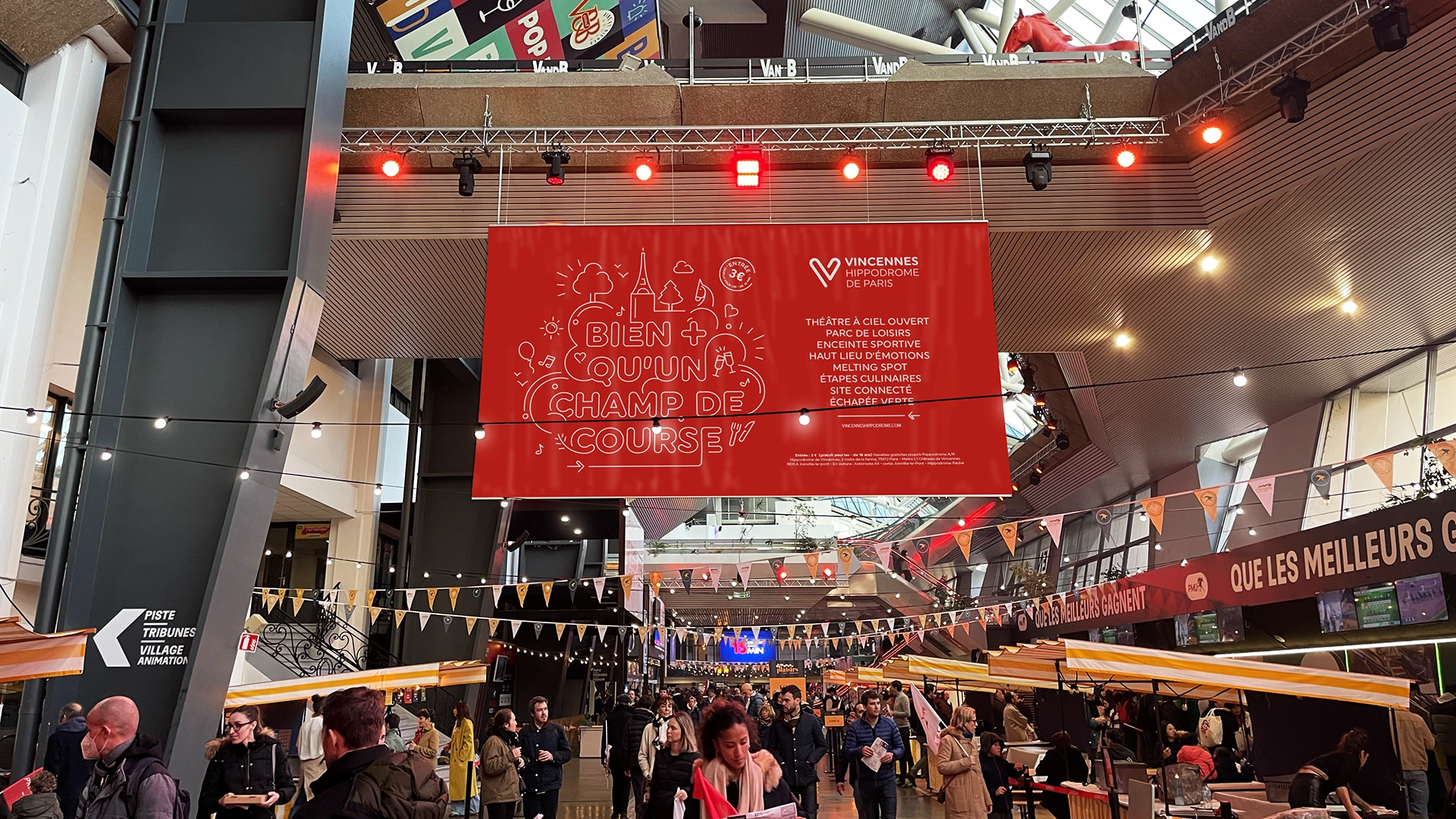
The symbol is not closed off, but rather open to new ambitions just like the racecourse. Resolutely contemporary in its single-line design, it allows for the deployment of a powerful visual identity in which the colour red—the red of passion—takes its rightful place. All the spaces have been fitted out to be completely consistent, and the racecourse’s identity is far more tangible.


“
Buoyed by its new visual identity, the Vincennes Hippodrome de Paris is thinking bigger and building its future as a place for leisure, sharing and feeling."
Grégory Garnier
Head of the Trot Marketing, Partnerships & Advertising Department


